Third, ignore the visibility of text
The ability of the human eye to recognize color has a certain limit. Because of the assimilation of color, the contrast between the color and the color is easy to distinguish, the weak is difficult to distinguish, and the color science is called the visibility. For example, if the picture is unclear, it is difficult to see the picture. Color on the layout
Usually combined with text, either the background color of the text, or the color of the text, which has the problem of the contrast between text and color. For readers, the important thing is the text. Therefore, the use of layout color must pay attention to the recognizability of the text. We use the color theory to describe the visibility of the text.
Japanese Putian dared to reveal the visibility of various contrasts in "Color Aesthetics": (Unit: M)
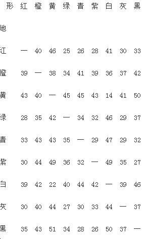
(color aesthetic contrast)
As can be seen from the table, yellow is the least visible on white newsprint. Orange is well-matched with any color, it has the advantages of red and yellow, soft and bright, easy for people to accept. The visibility of red is also high. Orange and red are commonly used colors in current newspapers. The combination of yellow-white, green-red, green-gray, cyan-red, violet-red, violet-black, and cyan-black, etc., has low visibility and should be avoided.
When we analyze the visibility of text, we must also fully pay attention to the advance and retreat of color. When we observe red, orange, yellow, green, blue, blue, purple, gray, and white multicolored stripes, we first see the red, yellow, orange, and white colors in our eyes, because these colors have high lightness. The purity is also high, giving a sense of progress. This is the forward and backward color. Advance color should not be used as background.
We do not advocate adding color blocks to the text because it will reduce the visibility of the text and should be avoided if the font size is not large enough. The background color of the text should be based on the premise that it does not hinder the reading of text. Therefore, it is advisable to use a small-size text with a certain length in soft and light colors as the background, and avoid the use of dark colors such as blue-green, blue-violet, and the like.
Fourth, excessive emphasis on color stimulation
When we look at colors in life, we feel that some colors are dazzling and look tired, such as yellow. This is due to the fact that the color stimulus of the retina is not the same as the degree of excitement. When people look at low-lightness (dark) colors, the degree of excitement on the retina is in a low-energy state, fatigue is small, and therefore does not feel dazzling.
Readers never want to read newspapers and do not want to damage their eyesight. Therefore, the color of the layout should be as low as possible with high visual fatigue. In general, high-intensity, high-purity color stimuli have high intensity and high fatigue. In the achromatic system, white has the highest lightness, and the lowest lightness is black; in the color system, the brightest is yellow, and the darkest is purple. This is why printing paper is not as white as possible. Paper printed text with too high whiteness can look dazzling and affect vision. Therefore, from the perspective of reducing fatigue, colored newsprint is more suitable for reading. One of the reasons why the newly created "Economic Observer" uses light orange newsprint is "to make the visual sense softer and not to be 'glare'."
The intensity of the color stimulus is high, and the layout is of course somewhat off. However, such colors should not be used in large areas, and the frequency should not be high. Although the degree of low-level color fatigue is small, it often makes people feel depressed, and we do not agree that the layout is too bleak. The ideal method is to use soft and bright light warm colors.
Layout color design, as a branch of design color, involves physics, physiology, psychology, and aesthetics. Different colors lead to different psychological effects, such as the arrangement of red, white, and blue colors in Americans and The hearts of the French will evoke patriotism. Others will not. Analysis of marketing theory suggests that perceptions of color-induced perceptions can influence consumers' perceptions of products or events. The visual factors of marketing information often fully demonstrate the attributes of a product. The layout color design should also be a symbol of the newspaper's personality and quality. Serious newspapers will not use discreet colors. Newspapers for the people of the city will not use the petty colours of the petty bourgeoisie like the so-called “prestige†publications. Color should become a part of the newspaper's overall image design, and it is an important consideration. The choice of colors should be very cautious and it should not be tolerated.